2023. 1. 23. 16:27ㆍ시각화 분석/Tableau Desktop Specialist
- 본 포스팅은 유데미의 Tableau Desktop Specialist Certification Prep 강의 중 섹션 8: Tableau Specialist Practice Exam 1의 내용을 토대로 작성되었음을 밝힙니다. 보다 정확한 내용은 아래 링크를 참고하세요.
https://www.udemy.com/course/tableau-specialist-certification-prep/
첫번째 모의고사 풀이 결과로 정답률 48%가 나왔네요. Prep강의 2.5회 수강 + 태블로 굿모닝 굿애프터눈 2회독 및 실습, 개인 프로젝트 1회를 수행한 결과랍니다. 시간이 부족해서 4문제는 못풀었구요.😣 전반적으로는 결과가 상당히 정직한 거 같네요!
합격선은 75%/100%니, 남은 3주는 그동안 익힌 개념을 토대로 문제 풀이에 집중하는 걸로... ✍️
아래에는 복습을 위해 틀리거나 풀면서 헷갈린 문제 등을 정리해봅니다.
보라색 글자는 정확한 확인이 필요한 부분입니다.
1. 틀린 문제
(1) Connecting to & Preparing Data
4. [Add joins and unions] When creating a union between tables, what will happen if the field names do not match?
a. Tableau will return an error message, explaining that you must modify the tables so that all tables used in the union have the same field names.
b. Tableau will automatically merge the fields, combining fields with similar field names.
c. Fields in the union that do not have matching field names will contain null values.
d. Fields with non-matching field names will be dropped, so that the union will contain only those fields with matching field names
Correct answer is C – if the field names do not match, the fields will be included in the UNION but will contain null values for the rows from the table that is missing the field.
https://onlinehelp.tableau.com/current/pro/desktop/en-us/union.html
6. Which of the following uses a primary and secondary data source?
a. Cross-database joins
b. Unions
c. Aggregation
d. Blending
Cross-database joins - 교차 데이터베이스 조인(다른 데이터 원본 연결)
Correct answer is D. Data blending involves a primary and secondary data source.
8. [Assign an alias to a data value] Which of the following can have an alias?
b. Values of a continuous measure
c. Values of a discrete dimensions
d. Values of a discrete measure

https://help.tableau.com/current/pro/desktop/en-us/datafields_fieldproperties_aliases_ex1editing.htm
You can rename field names, but you cannot alias them. Aliases can be applied only to discrete dimension values
9. [Assign a geographic role to a data field] Which of the following are predefined geographic roles? [select two]
a. Airport
b. Train terminal
c. Seaport
d. Geo code
e. Zip code
See the list here https://help.tableau.com/current/pro/desktop/en-us/maps_geographicroles.htm or check Tableau

(2) Exploring & Analyzing Data
12. [Display totals on a worksheet] A worksheet with a text table has the dimension PRODUCTS and the measure AVG(Discount). If totals are added to the worksheet, what default method will be used to calculate the totals?
b. The average of the values in the text table
c. The average of discount per row in the underlying data source
default method가 사용되긴 하는데, 적용되는 것은 뷰가 아니라 데이터 원본인 듯(?)
Explanation: we see below an example with the default method used for the grand total

The average of the values in the text table is (.08+.04+0+.1333)/4 = .063325, so the grand total is not the average of the values in the text table. Rather, it is the average of the values in the underlying data:

If you check the table here, https://help.tableau.com/current/pro/desktop/enus/calculations_totals_grandtotal_turnon.htm#options-for-calculating-grand-totals you can confirm that the default aggregation used in the grand total for average is, “Shows the average of the values shown in the row or column.”
13. For which of the following tasks would it make the most sense to use a parameter?
c. Allow the user to change the measure shown in the view. For example, to switch from seeing sale per order to seeing the count of distinct customers.
d. Allow the user to view the top 10 products with the highest total sales value given the current filters.
Explanation: C is correct because you could create a parameter with the different measures, and then a calculation that would use the measure specified by the parameter. https://help.tableau.com/current/pro/desktop/en-us/parameters_
16. Which of the following is a table calculation?
a. SUM
b. TOTAL
c. AVG
d. STDEV
테이블 계산(▵) - performed on the returned results on a view.
B - Of these, only TOTAL is a table calculation:

cf. Tableau의 상위 10가지 테이블 계산
https://www.tableau.com/ko-kr/blog/top-10-tableau-table-calculations
21. [Explain when to use a parameter] In which case would you most likely want to use a parameter?
a. To allow the viewer to select which dates range to show on a line chart
b. To allow the viewer to select which measure to show in a bar chart
a. 작업영역의 필터 슬라이더를 떠올렸는데, 필터 슬라이더가 파라미터 슬라이더와 비슷하게 생겨, 필터와 파라미터를 헷갈림😅
-> A can be done with a standard filter.
22. [Display totals on a worksheet] What Total All Using option was chosen for the following view?

a. First
b. Sum
c. Average
d. Minimum
e. Automatic
Grand Total = 총계


The value is the same as the first row, but first is not an option. The value shown for the grand total is the minimum of the values in the table, so the show all totals using Minimum option must have been chosen.
23. [Add a reference line] What steps can be used in creating a view with a reference line? [select two]
a. On the analytics pane, click on reference line and drag into the view.
b. On the toolbar, choose Analysis, then Reference Line and select Show Reference Line
c. On the toolbar, choose Format, then Reference Line and change the value from None to solid.
d. On the Show Me menu, select bullet graph
참조선 - 차트에 특정값에 해당하는 라인을 표기하여 값을 식별할 수 있도록 하는 기능
cf. trend line(추세선) - 측정값 사이의 관계 나타내기
A is correct as shown here

D is correct because bullet graphs include reference lines https://help.tableau.com/current/pro/desktop/enus/qs_bullet_graphs.htm

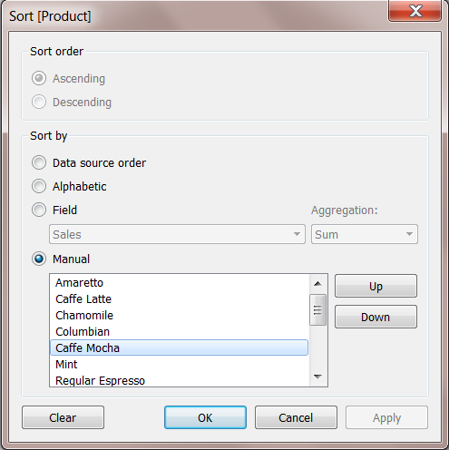
24. [Add a manual or computed sort] What sort type should be used to have sort order Low, Medium, High?
c. Manual
d. Data source order
e. Nested
Nested sort - 중첩된 정렬. Nested sorf는 sort order(정렬 순서)를 결정하는 데 사용할 값이 있는 필드를 선택할 수 있음
| 중첩 | 비중첩 |
 |
 |
| 중첩 정렬은 각 패널을 독립적으로 고려하고 패널별로 행을 정렬합니다. | 비중첩 정렬은 전체 패널의 값을 고려하고 모든 패널에서 같은 값 순서를 사용합니다. |
| [출처] https://help.tableau.com/current/pro/desktop/ko-kr/sortgroup_sorting_computed_howto.htm | |
When you want values sorted in a particular order, using “Manual” allows you to specify that order. Alphabetic won’t work because the alphabetic order would be High, Low, Medium. https://help.tableau.com/current/reader/desktop/ko-kr/reader_sort.htm
(3) Sharing Insights
27. What steps should you take to add a phone view to a dashboard?
a. Instruct the those viewing the dashboard on mobile to put “m.” in front of the dashboard URL to get the mobile-friendly view.
b. Select Layout, then adjust the dimensions until they are appropriate for a phone (750x1334)
c. On the “Show Me” menu, click the Phone icon
d. Select Device Preview, then select Phone for Device Type, then click the button labeled “Add Phone Layout”
버전이 바뀌면서 업데이트 되었나...? 일단 Tableau Public에서는 the button labeled "Add Phone Layout"은 보이지 않고, Dashboard 메뉴에서 같은 이름을 발견했다. Tableau Desktop에서 확인해보자.
Answer: D
https://help.tableau.com/current/pro/desktop/en-us/dashboards_dsd_create.htm


29. You have a scatter plot showing sales on the x-axis and profit on the y-axis, with each dot representing a different product subcategory. You want to show how the points on the scatter plot vary based on Net Profit, a third continuous variable. Which would be most appropriate? (Select all that apply)
a. Tooltip
b. Label
c. Size
d. Color
net profit - 순수익
Answer C & D: Size would be most appropriate, because with size it is clear that larger values are respresened by larger points on the plot. This is easier for the eye to process than understanding which color or size is associated with the larger values than it is to read a label or tooltip value on each point in the scatter plot. The Visual Analysis Best Practices Guidebook explains, “a rule of thumb is to put the most important data on the X- or Y- axis and less important data on color, size, or shape.”
a rule of thumb - 경험에 근거한 규칙
30. If you have bar chart with a single bar, but you want to subdivide that bar into multiple categories, what should you add to your view?
a. A measure
b. A dimension
c. A discrete field
마킹 실수... 😢
The answer is B – you need to add a dimension to your view to subdivide the bar.
31. Which of the following fields will have AGG in front of it when you add it to the view?
a. A calculated field with the formula SUM([Profit])
b. A measure called Profit
c. A date field
d. A calculated field with the formula 5 * [Profit]
Answer: A, since this is a measure that has an aggregation already built in, when you add it to the view you will see AGG in front of the field name
33. Which of the following functions can be used on string to create a measure?
a. SUM
b. COUNTD
c. +
d. DATEDIFF
Answer B. Of these functions, only COUNTD will take a string and return a measure.
40. [View and export underlying data] Which options can be used to export data as a CSV file?
a. From the toolbar, select Worksheet, then Export then Export Data to CSV
b. On the Data Source page, select the table you want to export on the physical layer canvas, click the arrow, and select Export Data to CSV
c. On the Data Source page, select Data. Then select Export Data to CSV
d. Right-click the data source name in the data pane, then select “Export data to CSV”
e. On a worksheet tab, click the View Data icon in the Data pane, and click the Export All button.
C and E are correct.
c. Export Data to CSV on the Data Source page

e. View Data icon
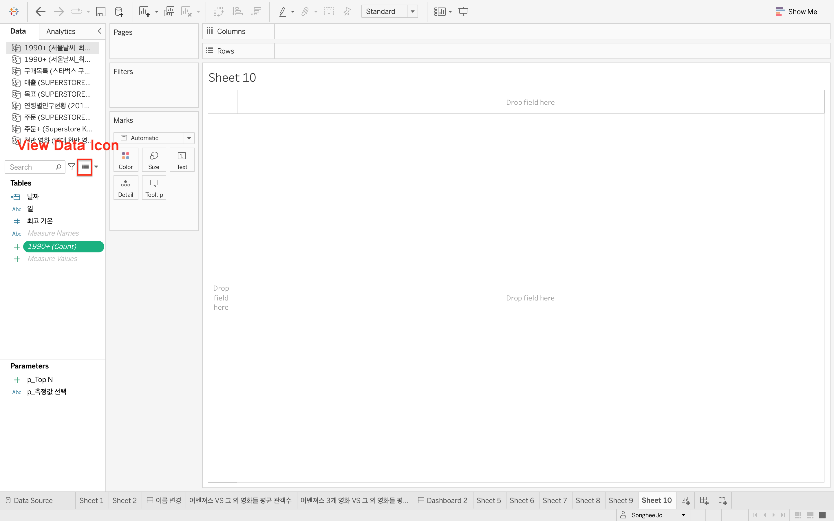
You can also right-click the data source name in the data pane to export to CSV.
2. 헷갈린 문제
(1) Connecting to & Preparing Data
1. [Explain when to use a join versus a relationship]
a. You are working with multiple tables that you’d like to combine into a single table for analysis
c. You wish to avoid data duplication when combining tables with different granularity
A is incorrect because relationships defer joins to the time and context of analysis rather than creating a single table for analysis.
3. Which of the following is the best reason to create a saved data source as a .TDS file
b. You want to save the default field properties such as number formats and sort order
Correct answer is B. TDS files save the data source metadata, such as the connection information, default field formatting, and sort order. They do not save the data source itself, and hence you should use this format if everyone who will use the data source has access to the underlying file or database defined in the connection information. Documentation here: https://onlinehelp.tableau.com/current/pro/desktop/en-us/export_connection.html
10. [Change default properties for a data field (number format, aggregation, color, date format, etc.)] Which of the following are default properties which can be assigned to a dimension? [select three]
a. Shape
b. Size
c. Color
d. Path
e. Sort
See the list here https://help.tableau.com/current/pro/desktop/en-us/datafields_fieldproperties.htm or try this in Tableau with a dimension:

(2) Exploring & Analyzing Data
11. [Create sets by using marks and the data pane] You have a scatter plot showing sales and profit by product subcategory. You wish to create a set from a cluster of high values sub-categories. What steps should you take?
a. Hold down the control key and click on the sub-categories of interest. Then right-click the data pane and select “Create set”
b. Highlight the sub-categories of interest. Then in the Marks card click “Set” and “Create Set”
c. Click and hold down the mouse, drawing a rectangle to select the sub-categories of interest. Right click and select ‘create set’
d. Select the sub-categories in the color legend, then right click and select “set” then “Create Set”
sales - 매출
wish to create a set from a cluster of high values sub-categories.
-> 고정된 집합 (고정된 집합의 멤버는 기초 데이터가 변경된 경우에도 변경되지 X
cf. 동적 집합의 멤버는 기초 데이터가 변경될 때 변경됩니다. 동적 집합은 단일 차원만 기반으로 할 수 있습니다.)
Answer is C.

Explanation - See the demo here: 고정된 집합 만들기 on https://help.tableau.com/current/pro/desktop/ko-kr/sortgroup_sets_create.htm#create-a-fixed-set
17. You would like to create a view showing the top 5 products by sum of sales for a given state or states. A set is used to select the top 5 products by sales. What type of filter should be used with state?
a. Multiselect Filter
b. Dimension Filter
c. Context Filter
d. Wildcard Filter
You would like to filter on the state, and then select the top 5 products with the greatest sales from within the selected state. Therefore, you need a filter which will execute before the Set. Dimension filters execute after sets, so they are the wrong choice. If you make the filter on the state a context filter, Tableau will filter on the state, and then the set will determine the top 5 products by sales within the selected state.
More detail here: https://onlinehelp.tableau.com/current/pro/desktop/en-us/order_of_operations.html#DimtoCtxt
18. Bins can be created for which type of field?
a. Dimension
b. Discrete
c. Continuous measure
d. Date
Answer is C. A bin can be created on a continuous measure or numeric dimension https://onlinehelp.tableau.com/current/pro/desktop/en-us/calculations_bins.html
20. [Use a quick table calculation] What steps would you follow to create a cumulative sum of the values shown in the view?
a. On the analytics pane, click totals and drag into the view. The Add to totals menu will appear. Release on the “Running Total” option.
d. Right-click the pill for the measure in the view, select quick table calculation and then select “running total”
The running total calculation will perform the desired calculation (See the below. That's it! And Running Total은 없다.)

(4) Understanding Tableau Concepts
36. [Format marks as shapes] Which of the following visualizations allow you to set the shape of marks?
a. Scatter plots
b. Heat maps
c. Symbol Maps
d. Circle views
e. Packed bubbles
Explanation: Scatter plots and circle views have marks with shapes that can be adjusted:

38. [Show and hide legends] Which of the following will remove a legend on a dashboard? [select three]
a. Click the arrow on the legend and select “Hide card”
b. Click the x to remove it from the dashboard
c. Click the arrow on the legend and select “Remove from dashboard”
d. Select the legend by clicking and drag it out of the dashboard canvas
e. Select the legend’s container, right click, and select “remove container.”
Explanation: “Hide card” is an option on the worksheet, not on the dashboard. Clicking X will remove

Down arrow will also work, as will dragging the legend off the canvas.

Removing the container will not remove the legend inside the container.